Bootstrap (Part-3) | Buttons, Glyphicons, Tables
- Introduction and Installation
- Grid System
- Vertical Forms, Horizontal Forms, Inline Forms
- DropDowns and Responsive Tabs
- Progress Bar and Jumbotron
Beautiful Buttons:We can make Buttons in Bootstrap in two ways ( or more specifically, using two tags ). Firstly, with the <a> tag and secondly by using the <button> tag.
<a href="https://www.geeksforgeeks.org"class="btn btn-danger">We can have Buttons in different colours using Bootstrap. Each having a specific name like btn-default, btn-primary, btn-success, btn-info, btn-warning, btn-danger and btn-link. All of them represent a specific colour of button.
Button with'a'tag </a>
<button type="button" class="btn btn-info" >Button with 'button' tag </button>
We can also make buttons of different sizes ( by using btn-lg, btn-sm, btn-xs and btn-block attributes)
- <a href=” “>Button with <a> tag </a>
Example:Output:<!DOCTYPE html><htmllang="en"><head><title>Bootstrap Example</title><metacharset="utf-8"><metaname="viewport"content="width=device-width, initial-scale=1"><linkrel="stylesheet"href="https://maxcdn.bootstrapcdn.com/bootstrap/3.4.0/css/bootstrap.min.css"></head><body><divclass="container"style="color:green"><h1>GeeksforGeeks</h1></div><divclass="container"><h2>Button Styles</h2><buttontype="button"class="btn">Basic</button><buttontype="button"class="btn btn-default">Default</button><buttontype="button"class="btn btn-primary">Primary</button><buttontype="button"class="btn btn-success">Success</button><buttontype="button"class="btn btn-info">Info</button><buttontype="button"class="btn btn-warning">Warning</button><buttontype="button"class="btn btn-danger">Danger</button></div><br><divclass="container"><h4>Button with <a> and <button> tag</h4>Button with <a> tag </a><buttontype="button"class="btn btn-success">Button with <button> tag </button></div></body></html>
- Gorgeous Glyphicons:Glyphicons is a library of precisely prepared monochromatic icons and symbols, created with an emphasis to simplicity and easy orientation. We can use Glyphicons inside the span tag like this:
<span class="Name of the glyphicon"> </span>
Glyphicons can also be used within buttons like this:<a href="" class="btn btn-default"><span class="Name of the glyphicon"> </span> </a>
One can see all the glyphicons available at http://getbootstrap.com/components for free. You can copy their names and paste within the quotes class=”Paste here”. If you need more specific glyphicon you can visit http://glyphicons.com/ and buy them.Example:
Ouput:<!DOCTYPE html><htmllang="en"><head><title>Bootstrap Example</title><metacharset="utf-8"><metaname="viewport"content="width=device-width, initial-scale=1"><linkrel="stylesheet"href="https://maxcdn.bootstrapcdn.com/bootstrap/3.4.0/css/bootstrap.min.css"></head><body><divclass="container"style="color:green"><h1>GeeksforGeeks</h1></div><divclass="container"><p>Correct<spanclass="glyphicon glyphicon-ok"></span></p><p>Incorrect<spanclass="glyphicon glyphicon-remove"></span></p><h4>Glyphicon with buttons</h4><spanclass="glyphicon glyphicon-backward"></span></a><spanclass="glyphicon glyphicon-pause"></span></a><spanclass="glyphicon glyphicon-play"></span></a><spanclass="glyphicon glyphicon-forward"></span></a></div><br><divclass="container"><spanclass="glyphicon glyphicon-thumbs-up"></span>Like Button</a></div></body></html>
- Tantalizing Tables:For creating tables, we need the <table> tag within which we use <tr> tag to define each row and <td>/<th> tag to represent actual data cell. In the table tag we can add different classes attributed to them which can make our table look better. Some of the table classes would be table-striped, table-bordered, table-hover, table-condensed, etc. You can find all the table classes here. The basic structure of the table is :
<table class="table-striped">
You can also add different colours to each row of the table using the colour in the
<tr>
<td>First Column</td>
<td>Second Column</td>
<td>Third Column</td>
</tr>
</table>
<tr> tag like <tr class=”danger”> </tr>
Similarly, you can also add colours to each cell by including the class of colours in the <td> tag.
Example:
Output:<!DOCTYPE html><htmllang="en"><head><title>Bootstrap Example</title><metacharset="utf-8"><metaname="viewport"content="width=device-width, initial-scale=1"><linkrel="stylesheet"href="https://maxcdn.bootstrapcdn.com/bootstrap/3.4.0/css/bootstrap.min.css"></head><body><divclass="container"style="color:green"><h1>GeeksforGeeks</h1></div><divclass="container"><h4>Tables using Bootstrap</h4><hr><hr><divclass="container"><divclass="bg bg-success"><tableclass="table table-hover"><trclass="danger"><td>First Column</td><td>Second Column</td><td>Third Column</td></tr><trclass="info"><td>Python</td><td>Java</td><td>Swift</td></tr><trclass="danger"><td>HTML</td><td>CSS</td><td>JavaScript</td></tr><trclass="info"><td>MySql</td><td>MongoDB</td><td>SQL lit</td></tr></table></div></div></div></body></html>You’ll learn more of Bootstrap stuff in the next article. Keep Learning!
ootstrap (Part-4) | Vertical Forms, Horizontal Forms, Inline Forms
- Introduction and Installation
- Grid System
- Buttons, Glyphicons, Tables
- DropDowns and Responsive Tabs
- Progress Bar and Jumbotron
Forms:
Bootstrap provides 3 types of form layout, namely:
- Vertical Forms (Default)
- Horizontal Forms
- Inline Forms
- We’ll look into each of them separately :
- Vertical Forms:First of all, we’ll initialize the form using <form> tag. We’ll wrap all the labels and form controls inside the tag <div class=”form-group”>. This is needed for optimum spacing between the form components.
Now, we can design the form within these tags as per our need. We can use a label to define a label for an input element. Remember that the <for> attribute of the <label> tag should be equal to the id attribute of the related element to bind them together. After the label tag, one can enter the <input> tag that specifies an input field where the user can enter data. The class to be used inside the input tag must be class=”form-control”. One can also use placeholder attribute which specifies a short hint that describes the expected value of an input field.
Example:
Output:<!DOCTYPE html><htmllang="en"><head><title>Bootstrap Example</title><metacharset="utf-8"><metaname="viewport"content="width=device-width, initial-scale=1"><linkrel="stylesheet"href="https://maxcdn.bootstrapcdn.com/bootstrap/3.4.0/css/bootstrap.min.css"></head><body><divclass="container"style="color:green"><h1>GeeksforGeeks</h1></div><divclass="container"><h4>Vertical Form</h4><formaction=""><divclass="form-group"><labelfor="id1">User Name</label><inputclass="form-control"type="text"id="id1"placeholder="Enter your User Name"></div><divclass="form-group"><labelfor="id2">Password</label><inputclass="form-control"type="password"id="id2"placeholder="Enter your password"></div><divclass="container"><buttontype="button"class="btn btn-success">Login</button><buttontype="button"class="btn btn-secondary">Register</button></div></form></div></body></html>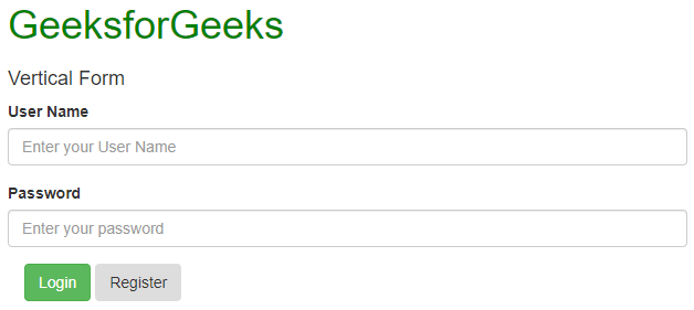
- Horizontal Forms:Horizontal forms are different from Vertical forms not only in the amount of markup, but also in the presentation of the form. To make a form horizontal, add class=”form-horizontal” in the <form> element. If you’re using the <label> element then you must use class=”control-label”. Also, remember that you can use Bootstrap’s predefined grid classes to align labels and groups of form controls in a horizontal layout.
You can also add particular styles to the labels and input field. Add any of the classes has-warning, has-success, has-error,etc. in the <div> tag which contains class which has form-group to give it different effects when selected.
Example:
Output:<!DOCTYPE html><htmllang="en"><head><title>Bootstrap Example</title><metacharset="utf-8"><metaname="viewport"content="width=device-width, initial-scale=1"><linkrel="stylesheet"href="https://maxcdn.bootstrapcdn.com/bootstrap/3.4.0/css/bootstrap.min.css"></head><body><divclass="container"style="color:green"><h1>GeeksforGeeks</h1></div><divclass="container"><h4>Horizontal Form</h4><formaction=""class="form-horizontal"><divclass="form-group has-success"><labelclass="control-label col-sm-2"for="id1">Username</label><divclass="col-sm-6"><inputclass="form-control"type="text"id="id1"placeholder="Enter your User Name"></div></div><divclass="form-group has-success"><labelclass="control-label col-sm-2"for="id2">Password</label><divclass="col-sm-6"><inputclass="form-control"type="password"id="id2"placeholder="Enter your password"></div></div><divclass="container"><buttontype="button"class="btn btn-success">Login</button><buttontype="button"class="btn btn-secondary">Register</button><lebel><inputtype="checkbox">Remember me</lebel></div></form></div></body></html>
- Inline Forms:As the name suggests, in an inline form, all of the elements are inline, left-aligned, and the labels are alongside. You just need to add the class=”form-inline” in the form element.
Using the class=”sr-only” you can hide the labels of the inline forms which might cause problems sometime.
You can also add glyphicons inside the forms. For that you have to add class=”has-feedback” and add the span tag in which the glyphicon is present after the <input> tag. Remember adding form-control-feed as the class of the span tag.
Example:
Output:<!DOCTYPE html><htmllang="en"><head><title>Bootstrap Example</title><metacharset="utf-8"><metaname="viewport"content="width=device-width, initial-scale=1"><linkrel="stylesheet"href="https://maxcdn.bootstrapcdn.com/bootstrap/3.4.0/css/bootstrap.min.css"></head><body><divclass="container"style="color:green"><h1>GeeksforGeeks</h1></div><divclass="container"><h4>Inline Form</h4><br><formclass="form-inline"action="/action_page.php"><labelfor="email">Username:</label><inputtype="email"class="form-control"id="email"placeholder="Enter Username"name="email"><labelfor="pwd">Password:</label><inputtype="password"class="form-control"id="pwd"placeholder="Enter password"name="pswd"><buttontype="button"class="btn btn-danger">Login</button><buttontype="button"class="btn btn-secondary">Register</button></form></div></body></html>
Comments
Post a Comment