Bootstrap (Part-5) | DropDowns and Responsive Tabs
- Introduction and Installation
- Grid System
- Buttons, Glyphicons, Tables
- Vertical Forms, Horizontal Forms, Inline Forms
- Progress Bar and Jumbotron
In bootstrap, dropdowns are created using the class=”dropdown”. What we will do is create a button and then convert the button into a dropdown.
As already started in the last few tutorials, buttons can be created using the <button> tag. But in this button, we want to create a dropdown, so we will add the class=”btn dropdown-toggle” and data-toggle=”dropdown”.
Basically, it would look something like this.
<button class=”btn btn-default dropdown-toggle” type=”button” data-toggle=”dropdown”> My Dropdown </button>
Now we want to convert this button into a dropdown. So, we’ll create an unordered list using the <ul> tag having class=”dropdown-menu” and add items using the <li> tag .
Example:
<!DOCTYPE html> <html lang="en"> <head> <title>Bootstrap Example</title> <meta charset="utf-8"> <meta name="viewport" content="width=device-width, initial-scale=1"> <link rel="stylesheet" href="https://maxcdn.bootstrapcdn.com/bootstrap/3.4.0/css/bootstrap.min.css"> </head> <body> <div class="container" style="color:green"> <h1>GeeksforGeeks</h1> </div> <div class="container"> <h4>Dropdown in Bootstrap</h4> </div> <div class="container"> <div class="row"> <div class="col-md-3"> <div class="dropdown"> <button class="btn btn-success dropdown-toggle" type="button" data-toggle="dropdown">GeeksforGeeks <span class="caret"></span> </button> <ul class="dropdown-menu"> <li><a href="#">HTML</a></li> <li><a href="#">CSS</a></li> <li><a href="#">JavaScript</a></li> <li><a href="#">SQL</a></li> </ul> </div> </div> </div> </div> </body> </html> |

You can make your dropdown better by using classes in the <li> tag. To add a header in a dropdown add class=”dropdown-header”, to add a divider between items, use class=”divider” and to disble an item in the list, use class=”disabled”.
Example:
<!DOCTYPE html> <html lang="en"> <head> <title>Bootstrap Example</title> <meta charset="utf-8"> <meta name="viewport" content="width=device-width, initial-scale=1"> <link rel="stylesheet" href="https://maxcdn.bootstrapcdn.com/bootstrap/3.4.0/css/bootstrap.min.css"> </head> <body> <div class="container" style="color:green"> <h1>GeeksforGeeks</h1> </div> <div class="container"> <h4>Dropdown in Bootstrap</h4> </div> <div class="container"> <div class="row"> <div class="col-md-3"> <div class="dropdown"> <button class="btn btn-success dropdown-toggle" type="button" data-toggle="dropdown">GeeksforGeeks <span class="caret"></span> </button> <ul class="dropdown-menu"> <li class="drodown-header container"><b>HTML</b></li> <li><a href="#">CSS</a></li> <li><a href="#">JS</a></li> <li class="divider"></li> <li class="drodown-header container"><b>Language</b></li> <li><a href="#"></a></li> <li><a href="#">Python</a></li> <li><a href="#">SQL</a></li> </ul> </div> </div> </div> </div> </body> </html> |
Navigation Tabs using Bootstrap:
To create a tabbed navigation menu, we need to make an unordered list using <ul> tag and then add class=”nav nav-tabs” . Now we can add our tabs using the <li> tag. Remember assigning one tab with class=”active” to view it as the default active tab. Now, we need to write the write the content of each tab using the class=”tab-pane” within the class=” tab-content”. Note that you must assign id’s to the respective tab-pane.
Adding the class=”fade” adds a fading effect when the tabs are switched.
Example:
<!DOCTYPE html> <html lang="en"> <head> <title>Bootstrap Example</title> <meta charset="utf-8"> <meta name="viewport" content="width=device-width, initial-scale=1"> <link rel="stylesheet" href="https://maxcdn.bootstrapcdn.com/bootstrap/3.4.0/css/bootstrap.min.css"> </head> <body> <div class="container" style="color:green"> <h1>GeeksforGeeks</h1> </div> <div class="container"> <h4>Navigation Tabs in Bootstrap</h4> </div> <div class="container"> <nav class="navbar navbar-default"> <div class="container-fluid"> <div class="navbar-header"> <a class="navbar-brand" href="#">Nav bar</a> </div> <ul class="nav navbar-nav"> <li class="active"><a href="#">Home</a></li> <li><a href="#">Practice</a></li> <li><a href="#">Interviews</a></li> <li><a href="#">Contribute</a></li> </ul> </div> </nav> </div> </body> </html> |

You can change the look and feel of the tabs by changing the class=”navbar-nav” to “nav-pills” or “nav-stacked” and if you want your tabs to cover the whole screen then, try adding the class=”nav-justified”
Similar to Dropdowns, we can disable any tab using class=”disabled”
Output:

Note: Be-careful during the use of nav-bar it will change it’s size depending on the screen size.
ootstrap (Part-6) | Progress Bar and Jumbotron
BootStrap articles :
We can add a progress bar to our webpage using progress class in a div class.
Use this code in your HTML code to add a default progress bar.
To create a progress bar:
Output:

To add a Jumbotron –
This article is contributed by Ayush Saxena. If you like GeeksforGeeks and would like to contribute, you
- Introduction and Installation
- Grid System
- Buttons, Glyphicons, Tables
- Vertical Forms, Horizontal Forms, Inline Forms
- DropDowns and Responsive Tabs
Progress Bar
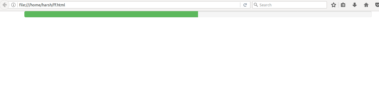
We all have seen a progress bar while executing some process in our computer. A progress bar shows how much of the process is completed and how much is left. You can add a progress bar in your web page using predefined bootstrap classes. Bootstrap has some predefined classes which can be easily used with HTML to style your webpages brilliantly and make your webpage responsive. Bootstrap provides many types of progress bars.We can add a progress bar to our webpage using progress class in a div class.
Use this code in your HTML code to add a default progress bar.
To create a progress bar:
- Use class progress inside a div class.
- Inside the already made div class, add another div tag with a class .progress-bar.
- Mention the progress of the bar under a style attribute using width as percentage. For eg- style=”width:50%
<div class="progress"> <div class="progress-bar" role="progressbar" aria-valuenow="50" aria-valuemin="0" aria-valuemax="100" style="width:50%"> <span>50% Complete</span> </div> </div> |
To remove the label from the progress bar, remove the span tag from the code.
Code for progress bar without label
Output

Code for progress bar without label
<div class="progress"> <div class="progress-bar" role="progressbar" aria-valuenow="50" aria-valuemin="0" aria-valuemax="100" style="width:50%"> </div> </div> |
Coloured Progress Bar
To add coloured progress bars ,we use different classes for different colours. Green – .progress-bar-success
Blue – .progress-bar-info
Yellow- .progress-bar-warning
Red – .progress-bar-danger
Use these class inside the div element to colour your progress bar
Code for Coloured Progress Bar
Output
To add coloured progress bars ,we use different classes for different colours. Green – .progress-bar-success
Blue – .progress-bar-info
Yellow- .progress-bar-warning
Red – .progress-bar-danger
Use these class inside the div element to colour your progress bar
Code for Coloured Progress Bar
<div class="progress"> <div class="progress-bar progress-bar-success" role="progressbar"aria-valuenow="50" aria-valuemin="0" aria-valuemax="100" style="width:50%"> </div> </div> |
Jumbotron
Jumbotron is a big grey box used to indicate some text which require extra attention. Any text that seems to be important can be written inside a jumbotron to make it appear big and noticeable.To add a Jumbotron –
- Inside a div element, use a jumbotron class.
- After this div tag, you can add any text or information you want.
- CLose the div element with class jumbotron.
Code for a jumbotronOutput
Comments
Post a Comment